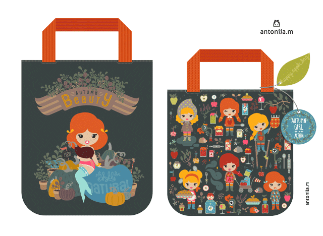
It's been a while
now since the GTS finalist were announced and with it the jury's review of the
finalists' work as well as some tips for the one who didn't make it to the next
round. Me included in the later group, although I see the semifinals as a huge
success for my work (being in top 50 out of 1500 submission – not bad, not bad
at all). Anyway, all this time my mind has been going back to the jury's
comments. The problem was that I really liked and still like my submission to
the semifinals and wasn't immediately receptive to the advice offered. Check
the jury's comments and the finalists' work out on Lilla's blog.
I know that wise
people listen to wise people. And the GTS jury is certanly a bunch of highly
knowledgable people from the licensing market. The market I'm aiming at. Am I
going to be a fool to reject that kind of input? Shouldn't I be smart enough to
listen to an insider tip? Well, I consider myself to be a bright lady, so I
decided to go for it. Let's do another work listening to the jury's advice. I'm
doing it just for myself. To learn something, to grow. You know how often we
nod with our head in sign of understanding when somebody offers us an advice or
know-how? The advice easily gets lost if not used. It all sinks in at the
moment when we start using the advice. That's why I decided to do it. To let
the knowledge get stuck on me.
One thing I made
clear to myself imediately – it's not going to be a redesign of the existing
design, it has to be a new concept yet true to my own style. It's not about
being a copycat. It's about building the tips into my style and creating a more
market oriented product.
Let's start. The assignment
was to create a Farmer's Market Autumn Tote Bag. I'll be going through the
jury's tips not in the order given, but in the order relevant to the process of
creating the concept and design for the tote. A short note: I changed from apples to pumpkins and kept a
similar color code to my old tote.
1.
Try
to make your work stand out from what is in the market already. Truly challenge
yourself to be unique in style.
2.
Rember
your audience's age. What style would most appeal toyour clients's cutomer? I
would add, always keep the target market in mind.
3.
Think
about the overall composition. Totes are meant to be fun and simple.
Here's what I
did: I upgraded my little ladies, better said, one of them grew up quickly into
a sexy farmer's daughter. Obviously inspired by the vintage pin-up girls. I
added the sexy factor for the more grown-up population, taking the design above
the teenager audience, yet staying true to my style and being cute. Btw. she
has a top on, but the purple pumpkin was placed on purpse this way to leave
different kind of interpretations open.
4.
Simplify.
Don't make it too busy for something like a tote bag. This particular
assignment naturally called for a strong central image. It's more than obvious
that I missed the brief completely with my old design. Too much going on
without a centrale image. O.k. I corrected that in this new design. The farmer's daughter is the focal
point of my design, while everything else builds around her creating a coherent
composition.
5.
Get
words involved; they're the secret weapon of great illustration. In the new
design I concentrated much more at the hand lettering (in my own way of
course). I used ambiguous wording – Autumn Beauty, refering to the girl as well
to the fruits of Autumn. The inscription on the blue pumpkin can also be read
as the pumpkins being all natural as well as the farmer's daughter. Plastic
surgery free.
7.
Create
a picture that shows a little 'narrative nano-second' – a moment that has sense
of timing. It's better than a scene that is just standing still. That's why I
created the mouse and cat scene. I put the action into the background not to
override my focal point. Initially there were also some snails involved on the
blue pumpking, but I left them out not to make it too bussy – see topic 4.
8.
Use
your imagination to create a unique way of showing an idea or telling a story.
I think I covered this topic by using my pin-up farmer's daughter.
I didn't use any
structures on the surfaces, I know it's trendy right now, but it just isn't me.
I like simple, yet clever and effective things. Contemporary and clean design
with a strong storytelling component.


